
Blue nights?
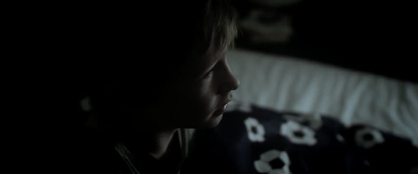
At the Broadcast Production and Post Forum I was chairman of the Meet the Colourist panel. I met with a couple of the panellists prior to the event and we had a great chat. One thing we had a good laugh at was the use of a blue wash as the look of night. I know it’s a really common method for creating a night look but I have always disliked it and apparently I’m not alone. I’m not sure if you have ever been awake at night and looked around but I’ll assume you have and if so, like me, you would have probably noticed that everything didn’t look blue. I don’t mind a bit of blue in outdoor scenes at dusk, you do get a bit of blue in the sky as the light dissipates but on an indoor scene in the middle of the night it just looks ridiculous. I guess this prompts the question, what does night or darkness look like? I most recently looked at this while grading a short called Mission. There was a scene with the young boy waking up in the middle of the night and going to check on his dad. I wasn’t too sure how I was going to make it look but I knew how I didn’t want it to look. I wanted it to be very obvious he was waking up in the middle of the night but at the same time needed to make sure it wasn’t so jarring as to detract from the story. I mostly worked with the contrast to a point where I was happy and still kept the colours muted. Striking the right balance between the scenes was a fine line and this has always been one of the things I love about working with colour. It’s all about making people feel a certain way but doing your best to go unnoticed. I’m always trying my best to have the colour fall into the background and allow the viewer to get lost in the story. Selling a moment but not becoming a distraction. It’s important not to let your ego get in the way of what you are trying to achieve. The story is always the most important thing, without it you are just looking at pretty pictures which brings me back to blue nights. Perhaps the thing I dislike the most about the blue night look is that it’s distracting. It’s jarring and lacks subtlety. You really need to apply a different method to working with darkness in everything you do. What may work for one film or programme won’t necessarily work for another. Sure throwing a blue wash on may do the job but it doesn’t do it well and it’s usually distracting and in my opinion a little lazy. If you are interested in checking out Mission give it a watch.


